Design Problem
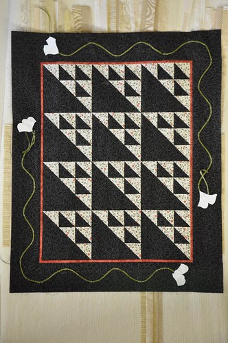
As I mentioned briefly in my last post, my appliqué design is comprised of a ¼" vine that snakes around the border of my quilt. The vine is decorated with 85 curvy flower and leaf shapes. It's a very lovely border design, by the way - I just do not think that it is working in the specific case of my quilt.
The best way for me to explain why I do not think that the border works in the case of my quilt is to show you the pictures that I took while I was working on pinning the vine:
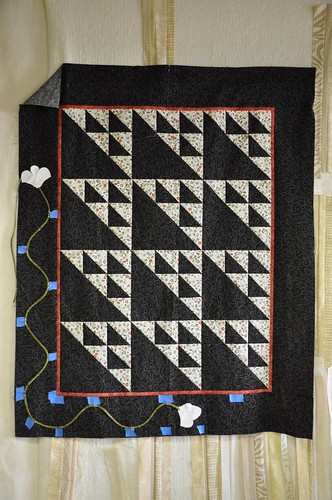
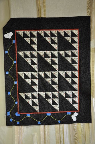
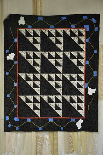
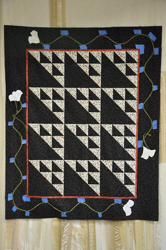
Yup, I pinned that fabric vine very carefully and very badly to my quilt top at least 5 times. I did not take a photograph of my first effort; it was just too embarassing bad. It took me hours and hours, over the course of about three days to do all that pinning. Each time, I would spend ages staring dubiously at the result before sighing and taking the vine off again.
After my 5th attempt or so (just in case I was suffering from a temporary bout of snaking vine sickness) I left the vine pinned to the quilt top for two days without the blue masking tape guides, while I worked on something else. Y'know, just to see if that improved how I felt about it:
In the end though, I just had to fall on my sword and admit that the vine was not working for me. I took it off and tried not to wince about all of those hours of fruitless pinning. Why wasn't it working for me? Well, I just felt that:
- the border was fighting for attention with the centre of the quilt - my eye was not sure whether to look at the centre of the quilt or at the border; and
- the curves of the snaking vine were at odds with the strong geometry of the quilt centre. For me, they were interrupting the very strong left to right and bottom to top movement of my flying birds. I quite like that movement.
Now, these problems are not apparent at all in the original design of the quilt. In fact, I am willing to bet that when I get to class on the 18th September, I will see other people's snaking vines on their quilt tops, they will be utterly gorgeous and I will feel as sick as a parrot for not perservering with my own!
I am wondering if they are troubling me on my quilt because I have strong colour contrasts in my blocks and quite strong colours in my appliqué shapes?
Perhaps if I had chosen a more subtle colour combination, I would not have tripped over this problem?
Perhaps the geometric centre would have faded a little more into the background and allowed the curvaceous border skip happily around the edges?
Headspace Problem
When I started work on this quilt I was feeling very homesick. I know that I have worked this into my quilt.
Pretty much from the outset, I knew that I wanted to hang this quilt on the North facing wall of my studio, between my two studio windows. So I added three blocks to the bottom of my quilt to extend it from being a 9 block quilt to a 12 block quilt. This means that the centre of my quilt has the same number of blocks as the panes of glass in my studio windows.
When I put my blocks together, I oriented them so that my flying birds would point North East. This happens to be the aeroplane flight path from Western Canada back to the UK.
When I was working on my quilt before I went home for the summer, I did not see this as being negative. I was really looking forwards to seeing all of my friends and family. I really wanted to get on a plane and follow my bird blocks North East. However, now that I am back, I keep looking at my quilt and I see the homesickness that I stitched into the centre of it.
This is bothering me a bit. Rather than frame and prettify my statement of homesickness with a lovely, curvy, flowery, hand stitched vine, I would like to work on my quilt so that it makes a more positive and balanced statement.
Do you know? I think that without the headspace problem, I might have battled on with the original border design. However, the fact that I am struggling with it from this perspective as well has lent a bit of weight to abandoning it and attempting something else.
With this in mind, I have been playing with some ideas that I'd like to share. I think that the opportunity to address the above lies in adjusting my border design and selecting appropriate patterns to stitch together the layers of my quilt.
Also, in view of the fact that it is now the 1st September, I am hoping that my alternative appliqué border idea will be a little less daunting and a bit more possible for a ham fisted hand sewer to achieve - at least I hope so!

3 comments:
I definitely prefer the quilt without the border. It looks so much more crisp and geometric, and I do think it's the strong contrast that gives this effect - in pastels, the vine would have been part of the background, but the whole quilt would have been far less striking. I love it as it is! But you could always applique on a line of geese if you are desperate to fill the space.
And I strongly believe quilts should mean something / tell a story. You should be able to look at it say "that was when I..." and the memories will come flooding back. That's a good thing, IMO, even if not all the memories are happy ones.
Re: Design - I think you're right. I like it better without the border, and I do think it has to do with the colours. Not so much the contrast (although that may be part of it) but just the fact that there is nothing referencing nature in the quilt... no greens, no browns, etc. With the vine it's almost a bit like a plant growing through cracks in the concrete or something like that? It's too bad, though, because I like the floral/vine thing and you did a lovely job. I think less is more, in this case, though.
Re: Headspace - this may be stupid, but could you just hang it upside down? Then they would point southwest instead of northeast? Landing instead of taking off? Hmm...
- Katy
Um, please don't laugh at me, but can't you just turn it upside down and you'll be flying home to Canada instead of home to England?
I also agree that it looks better without the curvy flower thingy. Maybe it needs some knitting tacked on it. ;)
Post a Comment